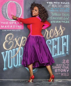
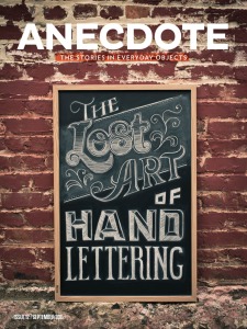
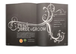
Last night I went out to eat and practically had an eyegasm when I saw the menu board. It wasn’t the food that looked so delectable, it was the typography. Someone had hand-rendered, in chalk, incredibly beautiful letterforms in the disguise of food offerings. It was amazing. I’ve seen this feat at other restaurants as well and truly admire the talent behind these works of art.
In my search for examples of beautiful menu board typography to complement this post, however, I got distracted by other fabulous designs/designers featuring chalk type. I couldn’t resist sharing them instead.


